How to Make a Restaurant Menu Design?
Designing a restaurant menu is a crucial aspect of the restaurant industry. A well-crafted menu does more than list the dishes offered; it serves as a reflection of the restaurant's brand, enhances the customer experience, and can significantly influence sales.
In this article, we will explore the various elements that make up an effective restaurant design menu. We will provide a step-by-step guide to creating one, and share best practices and tools that can help you achieve a professional and enticing menu for your establishment.

Importance of Menu of Restaurant Design
Good restaurant menu design is a critical aspect of restaurant management that impacts customer satisfaction, brand perception, and overall business success. By carefully considering the elements of menu design, restaurant owners can create a positive dining experience that encourages repeat visits and enhances the establishment's reputation.
First Impressions Matter
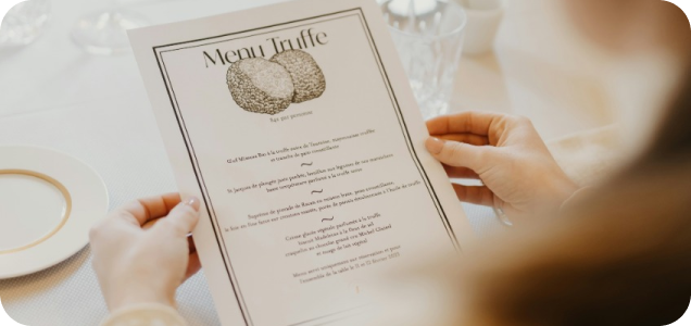
The menu is often the first tangible interaction customers have with your restaurant. A well-designed menu sets the tone for the dining experience, conveying the restaurant's ambiance, quality, and attention to detail. First impressions are lasting, and a visually appealing, easy-to-navigate menu can create a positive start to a meal. Ensuring that your menu immediately communicates the essence of your restaurant can help establish expectations and excitement for the dining experience.
A great restaurant menu design is more likely to engage customers, making them more interested in exploring the options available. The initial visual appeal, including the layout, colors, and imagery, can evoke curiosity and set a positive mood. A poorly designed menu, on the other hand, can lead to confusion or disappointment, potentially impacting the overall dining experience before it even begins.
Influence on Customer Choices
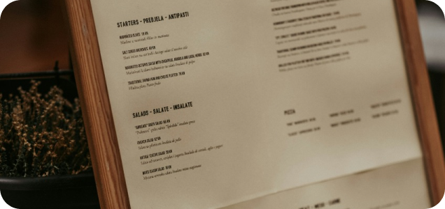
The layout, descriptions, and presentation of menu items can significantly influence what customers decide to order. Strategic placement of high-margin items, mouth-watering descriptions, and appealing images can guide customers toward specific choices, ultimately driving sales and enhancing their dining experience. Studies have shown that customers are more likely to order items that stand out visually and are described in an enticing manner.
The psychology behind restaurant menu card design involves understanding how customers' eyes move across the page and how certain elements can guide their decisions. For example, placing high-margin items in prominent positions, such as the top-right corner, can increase their likelihood of being ordered. Additionally, using persuasive language that emphasizes the unique qualities and flavors of a dish can make it more appealing. This technique, known as menu engineering, is a powerful tool for maximizing profitability.

Enhancing Your Brand
Your menu is a direct reflection of your restaurant’s brand identity. Consistent use of color schemes, fonts, and imagery that align with your brand’s personality can strengthen overall brand recognition and loyalty. A cohesive brand experience from the menu to the dining atmosphere helps in creating a memorable dining experience for your customers. A well-branded menu can make a lasting impression and differentiate your restaurant in a competitive market.
The design elements of the menu should seamlessly integrate with other branding aspects such as the restaurant’s logo, interior decor, and marketing materials. This consistency helps reinforce the brand in the minds of customers, making the dining experience more immersive and aligned with their expectations. For instance, a high-end restaurant might use elegant fonts and minimalistic design, while a family-friendly diner might opt for vibrant colors and playful fonts.
Key Elements of a Successful Food Menu Design
Several key components contribute to a successful restaurant menu card design, each playing a vital role in creating a positive customer experience. By focusing on these elements, restaurant owners can ensure that their menu is both functional and visually appealing.
Clear and Readable Font
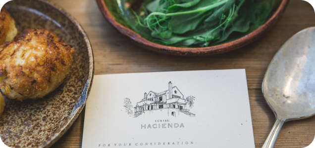
- Font Size: Ensure that the font size is large enough to be readable by all customers, including those with visual impairments.
- Font Style: Stick to simple, clean fonts and avoid overly decorative styles that can be hard to read.
- Spacing: Use adequate spacing between lines and sections to prevent the text from appearing cluttered.
Balancing aesthetics with functionality, ensuring that the text is not only attractive but also accessible, is crucial. Proper spacing between lines and sections can also improve readability, making it easier for customers to navigate the menu.
Logical Layout and Organization
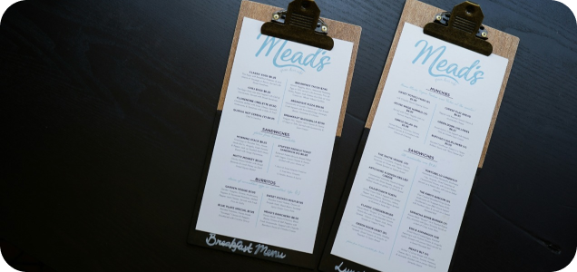
A logically organized restaurant menu board design helps customers find what they’re looking for quickly and easily. Grouping similar items together, using clear headings, and following a logical progression (e.g., appetizers, mains, desserts) can enhance usability. A well-organized menu reduces decision fatigue and allows customers to focus on their meal choices without feeling overwhelmed.
Effective menu layout involves not only the arrangement of items but also the flow of information. Menus should guide customers through a culinary journey, starting with appetizers and ending with desserts and beverages. Within each section, items should be listed in a way that makes sense, such as grouping vegetarian options together or listing dishes by main ingredient. This organization helps customers make quicker decisions and enhances their overall dining experience.
Effective Use of Colors
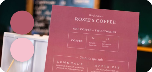
Colors can highlight important sections and reflect your brand’s personality. For example, warm colors like reds and oranges can stimulate appetite, while cool colors like blues and greens can create a calming effect. Ensure that the color scheme is consistent with your overall brand and enhances the readability of the menu. Thoughtful use of color can draw attention to high-margin items and create visual interest.
When choosing colors, consider these tips:
- Highlighting: Use colors to highlight special items or sections of the menu.
- Brand Consistency: Ensure the color scheme matches your restaurant's overall branding.
- Readability: Choose colors that provide good contrast to ensure text is readable.
The psychological impact of colors plays a significant role in restaurant menu styles. Red, for example, is known to increase heart rate and stimulate appetite, making it an effective color for highlighting popular or profitable dishes. On the other hand, green can evoke feelings of health and freshness, suitable for promoting salads and vegetarian options. The key is to use color strategically, balancing aesthetics with functionality to enhance the dining experience.
High-Quality Images
High-quality images of your dishes can make them more appealing and drive sales. However, it’s important to use professional photography and avoid cluttering the menu with too many images. Select a few key dishes to feature with mouth-watering visuals. Images should be well-lit, accurately represent the dishes, and be placed strategically to enhance the menu's overall design.
To effectively use images in your menu:
- Professional Photography: Invest in professional photography to ensure images are high-quality.
- Strategic Placement: Place images near high-margin items or specialties to draw attention.
- Consistency: Use images consistently in style and quality to maintain a cohesive look.
Visual appeal is crucial in influencing customer choices. High-quality images can make dishes look more enticing and help customers visualize what they will be ordering. However, overuse of images can clutter the menu and detract from its overall elegance. It’s best to feature a few standout dishes with professional photos that highlight their best attributes. Additionally, ensuring that images are consistent in style and quality can contribute to a cohesive and polished menu.
Steps on How to Design a Restaurant Menu
Creating a food menu involves several steps, each crucial to ensuring that the final product is both functional and appealing. This guide provides actionable steps that restaurant owners and managers can follow to develop a menu that enhances the dining experience.

Step 1: Define Your Restaurant's Concept
Align your modern restaurant menu design with the overall concept and theme of your restaurant. Whether you’re running a fine dining establishment, a casual café, or a fast-food outlet, the menu should reflect the ambiance and style of your restaurant. Consider the type of cuisine, target audience, and dining atmosphere when designing your menu to ensure consistency with your restaurant's concept.
Key aspects to consider include:
- Cuisine Type: Ensure the menu reflects the type of cuisine you offer.
- Target Audience: Design the menu with your target audience in mind, considering their preferences and expectations.
- Ambiance: Align the menu design with the restaurant's overall ambiance and decor.
The concept of your restaurant should be evident from the first glance at the menu. This includes the choice of language, the type of dishes listed, and the overall design aesthetic. For instance, a seafood restaurant might emphasize fresh, oceanic themes with nautical design elements, while an Italian trattoria could feature rustic fonts and imagery that evoke the charm of Italy. Ensuring that your menu aligns with your concept helps create a unified brand experience.

Step 2: Choose the Right Menu
Size and Format
Select a menu size and format that is practical and user-friendly. Consider the dining environment and how customers will interact with the menu. Options include single-page menus, booklet-style menus, or digital menus on tablets. The format should be easy to handle, durable, and suitable for the restaurant's setting.
Consider these options:
- Single-Page Menus: Ideal for quick service restaurants or smaller menus.
- Booklet-Style Menus: Suitable for larger menus with multiple sections.
- Digital Menus: Offer flexibility and can enhance the dining experience with interactive elements.
The size and format of the menu can greatly impact the customer experience. Large, unwieldy menus can be difficult to handle at the table, while very small or crowded menus can be hard to read. Consider the physical context in which the menu will be used, including table size and lighting conditions. Additionally, digital menus offer flexibility and can enhance the dining experience by providing interactive elements, such as images and detailed descriptions.

Step 3: Select a Color Schemethat Reflects Your Brand
Choose a color scheme that complements your restaurant’s branding and ambiance. The colors should be appealing and enhance readability. Ensure that there is a good contrast between the background and text. A consistent color scheme helps reinforce your brand identity and makes the menu visually cohesive.
Tips for choosing a color scheme:
- Brand Colors: Use colors that are part of your brand’s color palette.
- Contrast: Ensure there is sufficient contrast between text and background for readability.
- Emotion: Choose colors that evoke the desired emotional response from customers.
The color scheme should not only be visually appealing but also functional. High contrast between text and background ensures readability, especially in dimly lit environments common in many restaurants. Additionally, the colors should evoke the desired emotional response and align with the overall brand image. For instance, a health-focused restaurant might use greens and earth tones to emphasize natural ingredients, while a luxury establishment might opt for golds and deep reds to convey opulence.

Step 4: Organize Menu Sections Logically
Organizing the menu card for restaurant design logically helps customers navigate it with ease, enhancing their dining experience. This involves categorizing items in a way that makes sense and follows a natural progression.
Appetizers and Starters
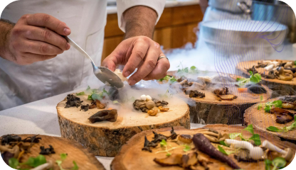
Begin with appetizers and starters. These are typically the first items customers will see, so ensure they are enticing and well-presented. Use descriptions that highlight unique ingredients and preparation methods to draw interest. Offering a variety of options, from light bites to more substantial starters, can cater to different tastes and preferences.
Key points for appetizers:
- Variety: Offer a range of appetizers to cater to different preferences.
- Descriptions: Highlight unique ingredients and preparation methods.
- Appeal: Ensure the appetizers are visually and descriptively appealing.
Appetizers set the stage for the meal, so they should be designed to impress. By offering a diverse selection and using tempting descriptions, you can entice customers to start their dining experience with excitement and anticipation.
Main Courses
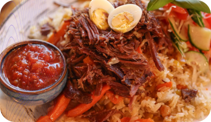
Follow with main courses. Group similar items together, such as vegetarian options, seafood, or meats. Consider using subheadings for clarity. This organization helps customers navigate the menu and find dishes that appeal to their preferences quickly. Including a mix of signature dishes and popular favorites can satisfy a wide range of tastes.
Consider these tips for main courses:
- Grouping: Group similar items together for easy navigation.
- Subheadings: Use subheadings to categorize main courses.
- Variety: Include a mix of signature dishes and popular favorites.
Main courses are the centerpiece of the menu, and organizing them logically can enhance the dining experience. Clear subheadings and grouping similar dishes together help customers find what they’re looking for quickly and make informed choices.
Desserts and Beverages
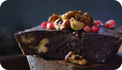
End with desserts and beverages. This section should tempt customers to finish their meal with a sweet treat or a refreshing drink. Highlight any special or signature items. Offering a variety of options, from indulgent desserts to light, refreshing choices, can enhance the overall dining experience and encourage additional sales.
When organizing desserts and beverages:
- Temptation: Ensure the descriptions are tempting and appealing.
- Variety: Offer a range of desserts and beverages.
- Highlights: Feature special or signature items prominently.
Desserts and beverages are the final touch to the dining experience. By offering a tempting array of choices and highlighting special items, you can leave a lasting impression and encourage customers to indulge further.
Step 5: Highlight Special Items
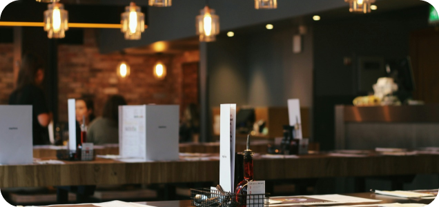
Use design elements like boxes, borders, or different font styles to draw attention to special or high-margin items on the menu. Specials, chef’s recommendations, and seasonal items can be spotlighted to guide customer choices. This technique helps promote dishes that are profitable or unique to your restaurant.
To highlight special items effectively:
- Design Elements: Use boxes, borders, or different font styles to highlight items.
- Promotions: Feature specials, chef’s recommendations, and seasonal items.
- Profitability: Highlight high-margin items to increase sales.
Highlighting special items can create a sense of exclusivity and urgency. Limited-time offers or seasonal dishes can encourage customers to try something new or make a return visit. Additionally, using eye-catching design elements can ensure these items stand out without overwhelming the overall menu design.

Step 6: Use Descriptive and Tempting Language
Write mouth-watering descriptions that entice customers to try your dishes. Highlight unique ingredients, preparation methods, and flavors to make each dish sound irresistible. Descriptive language can evoke sensory experiences and create anticipation for the meal.
Tips for writing effective descriptions:
- Ingredients: Highlight unique and high-quality ingredients.
- Preparation: Describe the preparation methods to add appeal.
- Sensory Words: Use words that evoke taste, smell, and texture.
Effective menu descriptions go beyond listing ingredients. They tell a story about the dish, highlighting what makes it special. For example, instead of simply listing "grilled chicken," a description could say "succulent grilled chicken marinated in our house blend of herbs and spices, served with a tangy lemon butter sauce." This approach engages the customer’s imagination and taste buds, making the dish more appealing.

Step 7: Proofread and Edit Thoroughly
Thoroughly check the menu for errors to maintain professionalism. Spelling mistakes, grammatical errors, or incorrect pricing can detract from the customer experience and harm your restaurant’s reputation. A well-edited menu reflects attention to detail and commitment to quality.
Steps for thorough proofreading:


Proofreading is crucial for maintaining the integrity and professionalism of your menu. Errors can be distracting and unprofessional, potentially leading to customer confusion or dissatisfaction. It’s advisable to have multiple people review the menu to catch any mistakes. Additionally, ensure that all pricing is accurate and consistent, and that descriptions are clear and informative.
Design for Food Menu Best Practices
Adhering to best practices can help ensure that your creative restaurant menu design is effective and appealing. These guidelines can improve the overall quality of the menu and enhance the customer experience.

Keep It Simple
Keep the food menu card design clean and uncluttered to avoid overwhelming customers. A simple, well-organized menu makes it easier for customers to make their choices and enhances their dining experience. Avoid excessive text, unnecessary images, or overly complex layouts.
To keep your menu simple:
- Clarity: Ensure the design is clean and easy to understand.
- Minimalism: Avoid cluttering the menu with too much information.
- Focus: Highlight key items without overwhelming customers.
Simplicity is key to creating a user-friendly menu. Cluttered menus with too much information can overwhelm customers and make it difficult for them to make a decision. Focus on providing clear, concise information and avoid overloading the menu with too many choices. This approach not only enhances readability but also creates a more pleasant and relaxed dining experience.
Focus on Readability
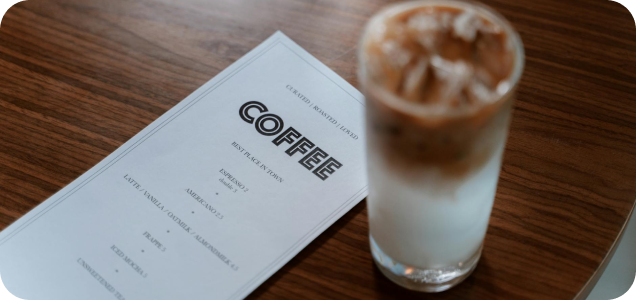
Ensure that the text is easy to read. Use a clear font, appropriate font size, and good contrast between the text and background. Avoid using too many different fonts or font styles. Readability is crucial for ensuring that all customers can easily understand the menu.
Consider these readability tips:
- Font Choice: Use clear, easy-to-read fonts.
- Font Size: Ensure the font size is large enough for all customers.
- Contrast: Choose colors that provide good contrast between text and background.
Readability is essential for a positive customer experience. Small fonts or low contrast can strain the eyes and make it difficult to read the menu, especially in dim lighting. Choose fonts that are clean and legible, and ensure there is adequate spacing between lines and sections. This attention to detail can make the menu more accessible and enjoyable to read.
Use Visual Hierarchy
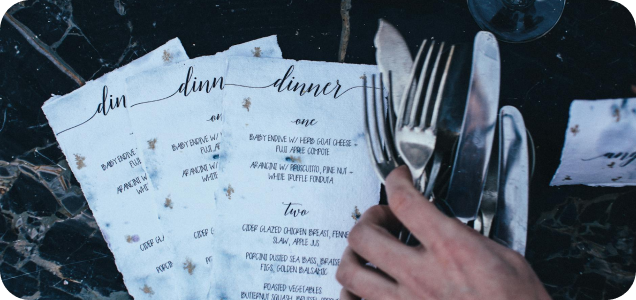
Employ visual hierarchy to guide customers’ eyes to the most important parts of the menu. Use larger fonts, bold text, or different colors for section headings and featured items to draw attention. This technique helps highlight key items and improves the overall flow of the menu.
To create an effective visual hierarchy:
- Font Size: Use larger fonts for headings and important items.
- Bold Text: Highlight key items with bold text.
- Color: Use different colors to differentiate sections and important items.
Visual hierarchy helps organize the menu in a way that guides the customer's attention naturally. By prioritizing certain elements, such as headings or special items, you can ensure that customers see the most important information first. Techniques such as varying font sizes, using bold or italic text, and incorporating visual elements like borders or shading can help create a clear and intuitive hierarchy.

Regularly Update Your Menu
Regularly update your menu to keep it fresh and relevant. Reflect seasonal changes, new offerings, and customer preferences. Updating trendy restaurant menu design shows that your restaurant is dynamic and attentive to trends. Regular updates can also address any issues with dish availability or pricing.
To keep your menu up-to-date:
- Seasonal Changes: Update the menu to reflect seasonal ingredients and dishes.
- New Offerings: Introduce new dishes and remove underperforming items.
- Pricing: Ensure pricing is up-to-date and reflects current costs.
Keeping the menu current is important for maintaining customer interest and ensuring that your offerings reflect the best of what your kitchen has to offer. Seasonal updates can showcase fresh, local ingredients and provide customers with new dining experiences. Regular reviews also allow you to adjust pricing, remove underperforming items, and introduce new dishes that align with customer preferences and market trends.
Tools and Resources for Design Menu Food
To create your own restaurant menu, you can use several tools. These options range from DIY solutions to professional services, offering flexibility based on your needs and budget.

Graphic Design Software
Graphic design tools like Adobe Illustrator, Photoshop, and Canva can help create a professional-looking menu. These tools offer templates, design elements, and customization options to suit your restaurant’s needs. Investing in design software can provide more control over the creative process.
Consider these software options:
- Adobe Illustrator: Ideal for creating vector-based designs.
- Photoshop: Great for detailed image editing and design.
- Canva: User-friendly tool with a range of templates and design elements.
Graphic design software provides the flexibility to create custom menus that perfectly align with your brand. These tools allow you to experiment with different layouts, fonts, and color schemes until you find the perfect combination. Additionally, design software often includes templates and assets that can streamline the design process and ensure a polished final product.
Menu Design Templates
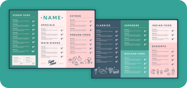
Using cool restaurant menu design templates can simplify the design process and ensure consistency. Many graphic design tools offer pre-made templates that can be customized to fit your brand and menu items. Templates provide a starting point and can save time in the design process.
Benefits of using templates include:
- Pre-made Templates: Choose from a variety of pre-made templates.
- Customization: Customize templates to fit your brand and menu items.
- Consistency: Ensure a consistent look across all menu formats.
Menu design ideas for restaurants are a great resource for those who may not have extensive design experience. Templates provide a structured layout that you can customize with your own text, images, and branding elements. This approach ensures consistency and can help you achieve a professional look with minimal effort. Templates are also useful for maintaining a cohesive design across different menu formats, such as print and digital.

Professional Design Services
Consider hiring professional design services for a polished and refined menu. Graphic designers can provide expert advice and create a custom menu that perfectly reflects your restaurant’s brand and style. Professional services can be particularly beneficial for complex designs or when launching a new concept.
Advantages of professional services:
- Expert Advice: Benefit from the expertise of professional designers.
- Custom Design: Get a custom menu that perfectly reflects your brand.
- Complex Designs: Ideal for complex designs or major rebranding efforts.
Professional designers bring expertise and creativity to the table, ensuring that your menu is not only visually appealing but also strategically designed. They can offer insights into the latest design trends, color theories, and typography best practices. Hiring a professional can be especially valuable for new restaurants or major rebranding efforts, where first impressions are critical.
Integrated Restaurant Management Systems
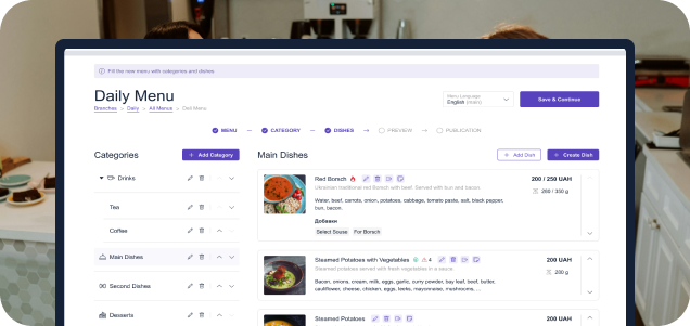
Using an integrated POS restaurant system like ME-POS can simplify menu updates and inventory management. These systems allow for easy adjustments to the menu, seamless synchronization with inventory, and enhanced efficiency, ultimately improving customer satisfaction. Integrated systems can streamline operations and ensure that the menu remains accurate and up-to-date.
Benefits of integrated systems include:
- Easy Updates: Simplify menu updates and adjustments.
- Inventory Management: Synchronize menu with inventory for accurate availability.
- Efficiency: Enhance overall efficiency and customer satisfaction.
Integrated restaurant management systems provide a comprehensive solution for menu management. These systems can help you keep track of inventory, update menu items in real-time, and analyze sales data to make informed decisions. By integrating menu design with overall restaurant management, you can ensure consistency and efficiency across all aspects of your operation.

Conclusion
The best menu restaurant design is more than just a list of dishes; it is a powerful tool that can enhance customer experience, reflect your brand, and drive sales. By understanding the importance of cool restaurant menu designs, incorporating key elements, following a step-by-step guide, and adhering to best practices, you can create a menu that not only appeals to your customers but also supports your business goals. Utilize available tools and resources, and don’t hesitate to seek professional help if needed. A great menu is an investment in your restaurant’s success.
View more
Related Articles
View more

